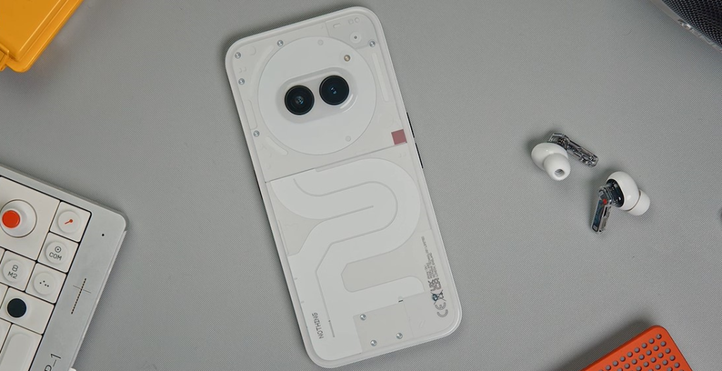
The upcoming Nothing Phone (2a) is set to make a statement in the smartphone market with its innovative design and features. The team behind the phone has shared insights into the design philosophy and enhancements that set this model apart from its predecessors.
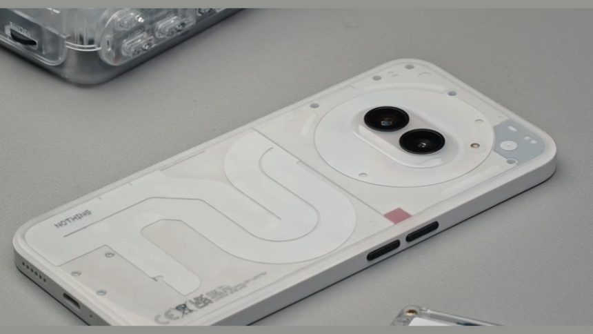
Lead Industrial Designer, Chris Weightman, highlighted the significant shift in the phone’s design by moving the camera to the center from the left corner, creating a unique visual appeal. The transparent back cover of the phone now incorporates white pigment for a diffused effect, offering a fresh aesthetic compared to previous models. Moreover, the decision to use a plastic back instead of glass allows for transparency to wrap around the edges, providing a glimpse of internal components when viewed from the side.
Lucy, CMF Designer at Nothing, emphasized the evolution of their design language with a focus on black and white identity. She confirmed that new colors will be introduced for the Phone (2a), expanding beyond the traditional Black and White options.
The phone boasts a glossy finish on the back for light reflection, a textured finish on the sides for better grip, and anodized aluminum finish on the side buttons, enhancing both aesthetics and functionality.

Max, Experience Design Lead at Nothing, shed light on the unique feature of 3 segments of LEDs in the Phone (2a) compared to 11 in its predecessor. This design choice aims to make the phone more affordable while maintaining a visually appealing glyph effect. Despite using fewer LEDs, this design required meticulous work to achieve. Max also mentioned that there are no plans to introduce new colors for the glyph LEDs.
As anticipation builds for the official launch, details regarding camera specifications, battery capacity, display features, and more are expected to be unveiled soon. The Nothing Phone (2a) promises to deliver a blend of cutting-edge technology and distinctive design elements that cater to a wide range of users looking for an innovative smartphone experience.


